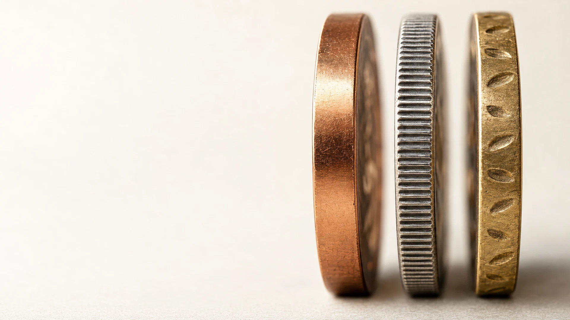
Coin edge styles are the treatment around a piece’s outer circumference: a plain edge is smooth, a reeded edge has repeating grooves, and a lettered edge carries words, numerals, or symbols. Although it occupies a narrow band of surface area, the edge can change how a piece feels in hand, how a design reads, and how much information the design needs to carry.
For a collector-led metal project, the best edge is usually the one that supports the concept without asking the edge to do too much. Start with the design’s tone and any information that must be present, then consider how the edge will relate to the main faces. This guide covers the vocabulary and design questions; the broader private minting guides explain the surrounding process.
The edge is not the rim
The edge is the narrow outer border that runs around the entire piece. It is sometimes called the third side because it is distinct from the obverse and reverse. The rim is different: it is the raised border at the outer area of each face, adjacent to the field and design. The U.S. Mint distinguishes the two and identifies plain, reeded, lettered, and decorated as edge categories in its Anatomy of a Coin.
A rim frames the artwork on a face; an edge occupies the thickness between the faces. A feature near the face may resemble an edge detail in a rendering, but it is not the same thing as a treatment that continues around the circumference.
Treat the edge as a third design surface, but let it complement rather than rescue the main faces. The central motif, readable text, and a clear boundary come first.
How plain, reeded, and lettered edges differ
Plain edge
A plain edge has no deliberate lettering, grooves, or repeating ornamental device. Its value is visual quiet: it lets the profile and the faces do the talking. A smooth edge can suit a design with a clean, contemporary, or understated direction. It also creates a useful contrast when the faces contain dense relief, a border pattern, or substantial wording. “Plain” does not mean unfinished; it is an intentional absence of edge devices.
Reeded edge
A reeded edge uses evenly spaced vertical grooves or ridges around the circumference. It introduces a familiar tactile rhythm and a more technical, coin-like visual cue. Historically, milled or reeded edges helped reveal alteration to coins whose metal value depended on their mass. The Royal Mint notes that British coinage used milled edges from the 1660s in response to clipping, the removal of metal from a coin’s circumference (The Milled Edge Motif). On a modern collector piece, that history can add a traditional reference, but it need not dictate the creative reason for choosing reeding.
Lettered edge
A lettered edge places an inscription, date, numerals, or symbols around the outer border. It can move a concise message off the faces, preserve more open field space, or reward close inspection. It is not a substitute for a clear obverse or reverse: edge text is read from the side and may be less immediately visible. Short, purposeful wording tends to work conceptually better than trying to relocate a full paragraph to the circumference.
Choose the edge from the design’s job
Start with what the piece is meant to communicate. A memorial or commemorative concept may benefit from an edge inscription that acts like a quiet secondary dedication. A design built around symmetry, heraldry, or a classic numismatic reference may find that reeding reinforces the intended character. A graphic illustration or a design with a strong perimeter may be more coherent with a plain edge.
Next, decide which information must be visible at first glance. If a name, date, motto, or attribution is essential to identifying the concept, it may belong on a face rather than only on the edge. Edge lettering works best for information that adds context after the initial read, not for the sole statement that makes the design intelligible.
Finally, treat the edge as one item in a complete brief. The piece’s dimensions, thickness, relief, artwork, and proposed edge treatment influence one another. Those tradeoffs are project-specific, so record the creative preference and ask for it to be assessed during custom project planning.
- What should someone notice first when the piece is viewed face-on?
- Is the edge meant to feel neutral, traditional, decorative, or informational?
- Could the proposed edge text remain clear if it must be read in segments?
Prepare an edge note for a project review
An effective brief does not need to prescribe a production method. State the intended edge style, the visual reason for it, and any non-negotiable wording or symbols. If you have a historical reference, describe what you are responding to—for example, the even texture of reeding or the discovery element of edge lettering—rather than assuming a reference can be copied exactly.
For a lettered edge, provide the text exactly as intended, including punctuation, capitalization, separators, and the desired reading order. For reeding, identify whether the goal is primarily a classic look or a tactile one. For a plain edge, note whether the smooth profile is important to the design. These details help turn a preference into a reviewable question alongside the piece’s overall format; the project formats overview can help frame that larger layout conversation.
- Preferred edge style: plain, reeded, lettered, or another described treatment.
- Exact inscription or symbols, if any, with approved spelling and punctuation.
- One reference image or a short explanation of the desired visual character.
- The relationship between the edge and the face artwork, especially any border or rim detail.
Frequently asked questions
What is the difference between a reeded edge and a ridged rim?
Reeding is the repeating treatment around the outer circumference. A rim is the raised border on the face of a piece, positioned around its design and field. They can work together visually, but they are separate features.
Why did older coins use reeded or milled edges?
On precious-metal coins, an altered circumference could signal that metal had been clipped away. The Royal Mint describes the introduction of milled edges in 17th-century Britain as a response to clipping. Today, reeding can still suggest that tradition, while also serving as a tactile and aesthetic design choice.
Can an edge carry a date or inscription?
A lettered edge can carry concise words, numerals, or symbols. Because it is viewed from the side, it is better used for supporting information or a secondary design moment than for the only text required to understand the piece. The appropriate treatment should be confirmed for the individual project.
A project conversation
Bring the edge into the design conversation
Once the faces, purpose, and preferred edge treatment are clear, a project review can help identify the questions that need project-specific confirmation. Share the concept, artwork or references, and the edge direction you want to explore.
Start a project reviewClosing perspective
A coin edge has an outsized effect on character. Plain edges emphasize the faces, reeded edges introduce texture and a historic visual language, and lettered edges create room for a secondary message. The right choice is the one that makes the piece feel resolved.
Use edge terminology to describe the intention, not to lock in assumptions. Include the edge alongside the artwork, wording, and format when the concept is ready for discussion.