Coin relief is the part of a minted piece that stands above the surrounding background, or field. It gives a portrait, emblem, lettering, or border a physical place in the composition rather than leaving it as a flat drawing. Depth needs room and clear transitions to read well. For more foundational terminology, the private minting guides hub provides the wider context.
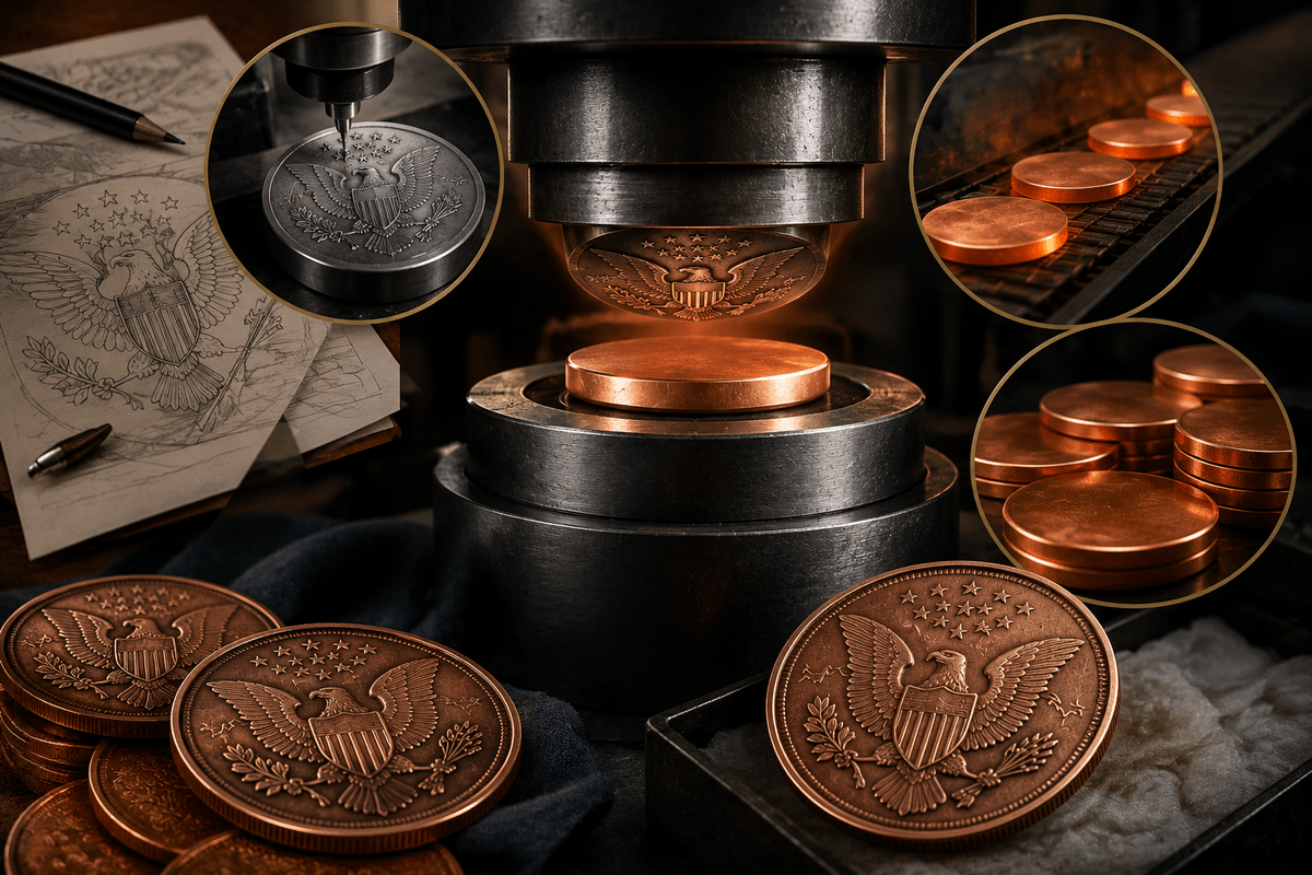
The raised image is created by a reverse, recessed die pressing a prepared blank; the U.S. Mint describes the die as a negative that transfers the positive image onto the blank (U.S. Mint, “Die Making”). That reversal matters because relief is not decoration added after the fact. It is part of how the design is modeled and transferred into metal.
What coin relief means
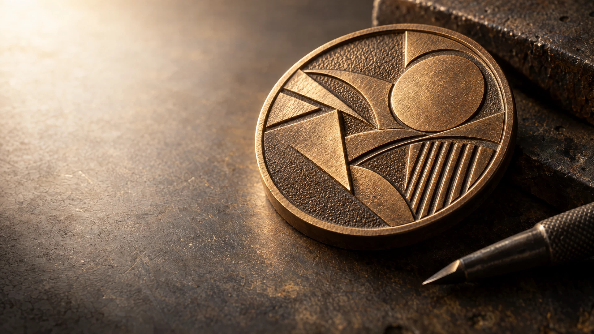
Relief is the change in level between the field and the design above it. The field is the open ground surrounding the imagery; devices such as letters, figures, borders, and symbols rise from it. It is a physical landscape rather than a printed image.
The opposite is incuse detail, cut below the surface. The Royal Australian Mint explains the tooling relationship plainly: a reduction punch carries a positive, raised or relief impression, while the production die carries the negative impression used to strike blanks (Royal Australian Mint, “Minting process”). Raised lettering and a recessed line can coexist, but they serve different visual roles.
Relief should not be confused with finish. Finish concerns the way a surface reflects light or is treated; relief concerns where that surface sits in space. Texture may make a raised device appear more pronounced, yet it does not replace a clear difference between device and field.
How a raised design is transferred to metal
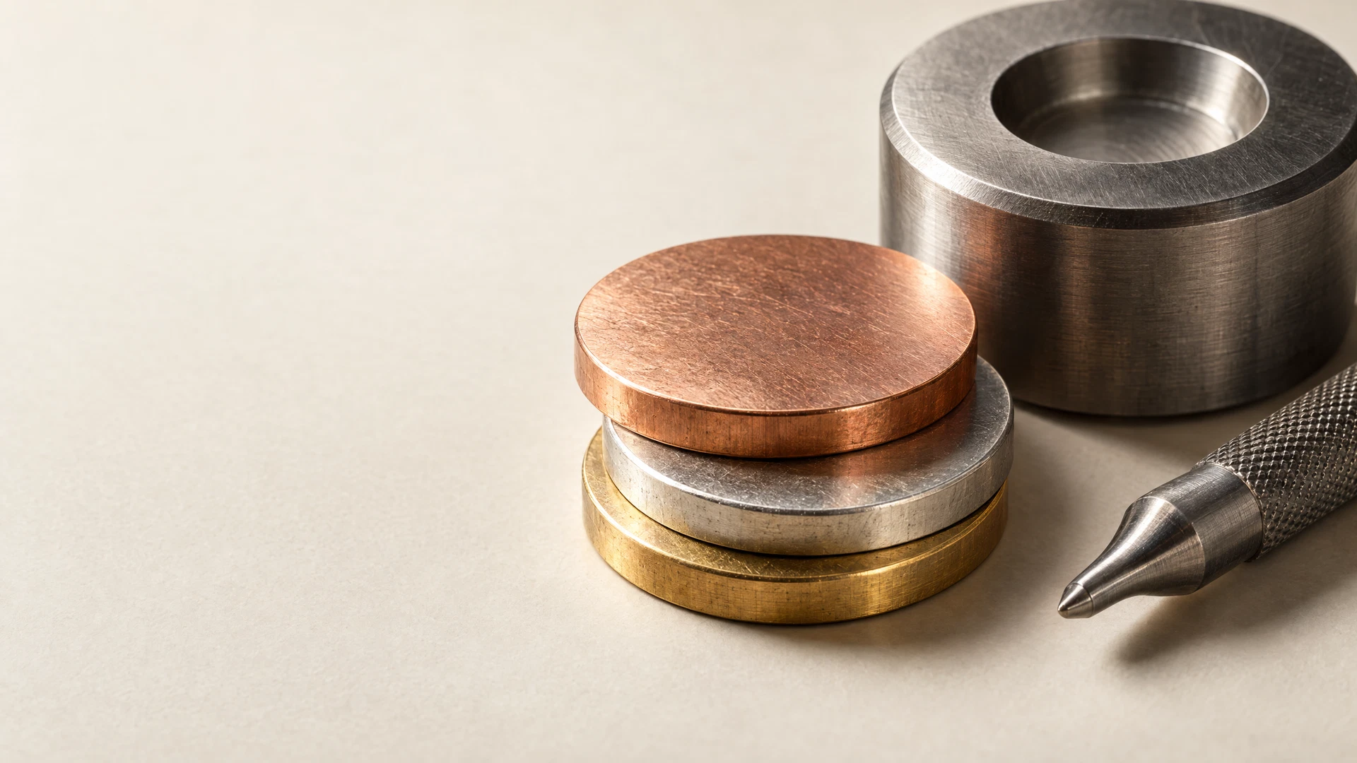
A relief concept moves through a reversal before it reaches metal. The model or hub presents the design positively; the working die carries its negative form. As the dies meet the blank, metal flows into the die’s recesses and takes the positive design. The U.S. Mint notes that a collar contains the metal as the piece is struck (U.S. Mint, “Coin Production”).
A raised mountain, letter, or face is not considered in isolation: surrounding channels, the field, rim, and neighboring details are part of the modeled relationship. The Royal Mint Museum likewise describes tooling moving between relief and incuse stages before the final die is made (Royal Mint Museum, “Collection in Context”).
This is the relief-specific layer of the process, not a complete production walkthrough. For the broader sequence from blank to struck piece, see how a copper piece moves through die striking.
Why relief changes the way a design reads
Relief directs attention. Clearly separated forms usually catch the eye first, especially as changing light crosses the piece. A central emblem can become the focus without every element sharing its height.
The field does quiet work. An open field provides contrast around important forms. If every space is filled with texture, fine lines, and equally raised elements, a design can lose its focal point. Detail needs a rank.
Think in three layers: field, supporting forms, and lead subject. A wreath might sit behind a shield, while a border frames both. This relief map turns a request for “more dimension” into a decision about foreground and background.
- Use the strongest level change for the primary symbol, portrait, or message.
- Let secondary devices reinforce the composition rather than duplicate the focal point.
- Preserve uncluttered areas around important lettering and silhouettes.
- Treat tiny marks as supporting texture unless they need to be read at a glance.
Balance depth, spacing, and legibility
More relief is not automatically better. A tall central form can be memorable, but its effect depends on its transition into the field and the room around it. A shallower, cleaner form may communicate more effectively than a dramatic form with no breathing room.
Lettering is a useful test. It needs separation from the field, space between characters, and distance from other raised elements. The same principle applies to any small visual unit.
Rims and borders deserve attention too. They can contain the design, but an assertive border can compete with a quieter central image. Decide whether a border is a frame, a decorative participant, or a lead feature.
Describe relief intent before a project review
You do not need a production specification to communicate a relief idea. Name the visual priority: an emblem forward, a scene with a distant background, or clean perimeter lettering. Then identify what should stay quiet so the lead subject has room.
Separate physical relief from an effect created by color or texture in a reference. Ask whether the result depends on a raised edge, a recessed line, an open field, or surface appearance. That distinction supports a more useful feasibility discussion.
If depth carries the story of your concept, bring that priority into custom project planning. The conversation can then focus on the intended reading rather than an undefined request for “more 3-D.”
Frequently asked questions
Is high relief always better than low relief?
No. High relief can suit a sculptural focal point, but it is not a general measure of quality. Choose the relationship that keeps subject, lettering, border, and background clear.
What is the difference between relief and incuse detail?
Relief rises above the field; incuse detail is recessed below the surface. Mint tooling uses the positive and negative versions of a design at different stages, as described by the Royal Australian Mint’s minting-process explanation (source).
Can lettering be part of the relief?
Yes. Lettering can be raised, recessed, or combined with other levels. It should be considered within the overall relief hierarchy, not as an afterthought.
Does a darker or shinier surface create relief?
No. A surface change can make existing relief easier or harder to see, but it does not create the physical level difference. Relief is modeled into the design; surface treatment is separate.
A project conversation
Make the design’s depth intentional
When relief carries the main visual idea, a project review can start with what should stand forward, what should recede, and which details must stay readable. Share the concept and its intended hierarchy for a project-specific discussion.
Start a project reviewClosing perspective
Coin relief is a hierarchy of physical levels. The field gives raised devices contrast; lead forms establish the first read; supporting lines and textures add information without taking over. “Dimension” then becomes a practical design decision.
Use relief to guide the eye and support the piece’s story. The minting-guides resource hub covers terms that make a collector-led concept easier to discuss.